Reducing Friction for WestJet's Booking System  

Context
Problem
Prototype
User system
Design System, Socials
Key Takaways

Context

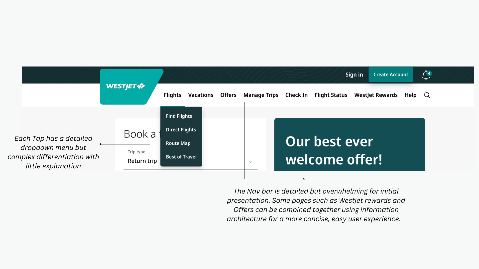
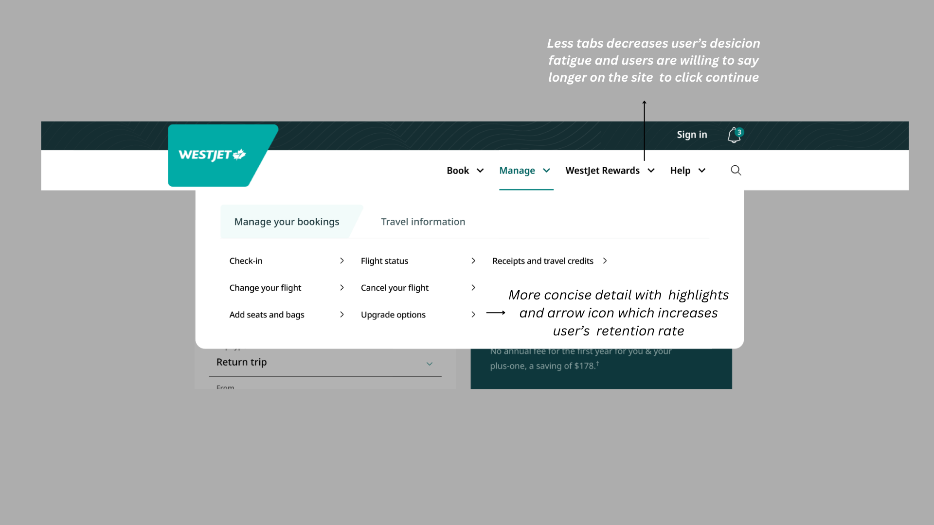
WestJet’s booking system prioritizes comprehensive information, but this creates friction for users booking spontaneous or budget-focused trips. This project addresses those concerns by adjusting WestJet's desktop user experiences through simplified information architecture, streamlined user flow, and reusable design systems. In result, usability testing showed a potential 10% increase in user retention.

6 min read

Project
Conceptual group project
Project type and duration
4 Month School Project

Collaborators
3 UX designer
1 Web Developer
Skillsets
Figjam (User research)
Figma (Prototyping, Hi fidelity Interphases)
My Role
Information Architecture, Social Assets, Hi- Fi Prototype and Final Presentation

Problem

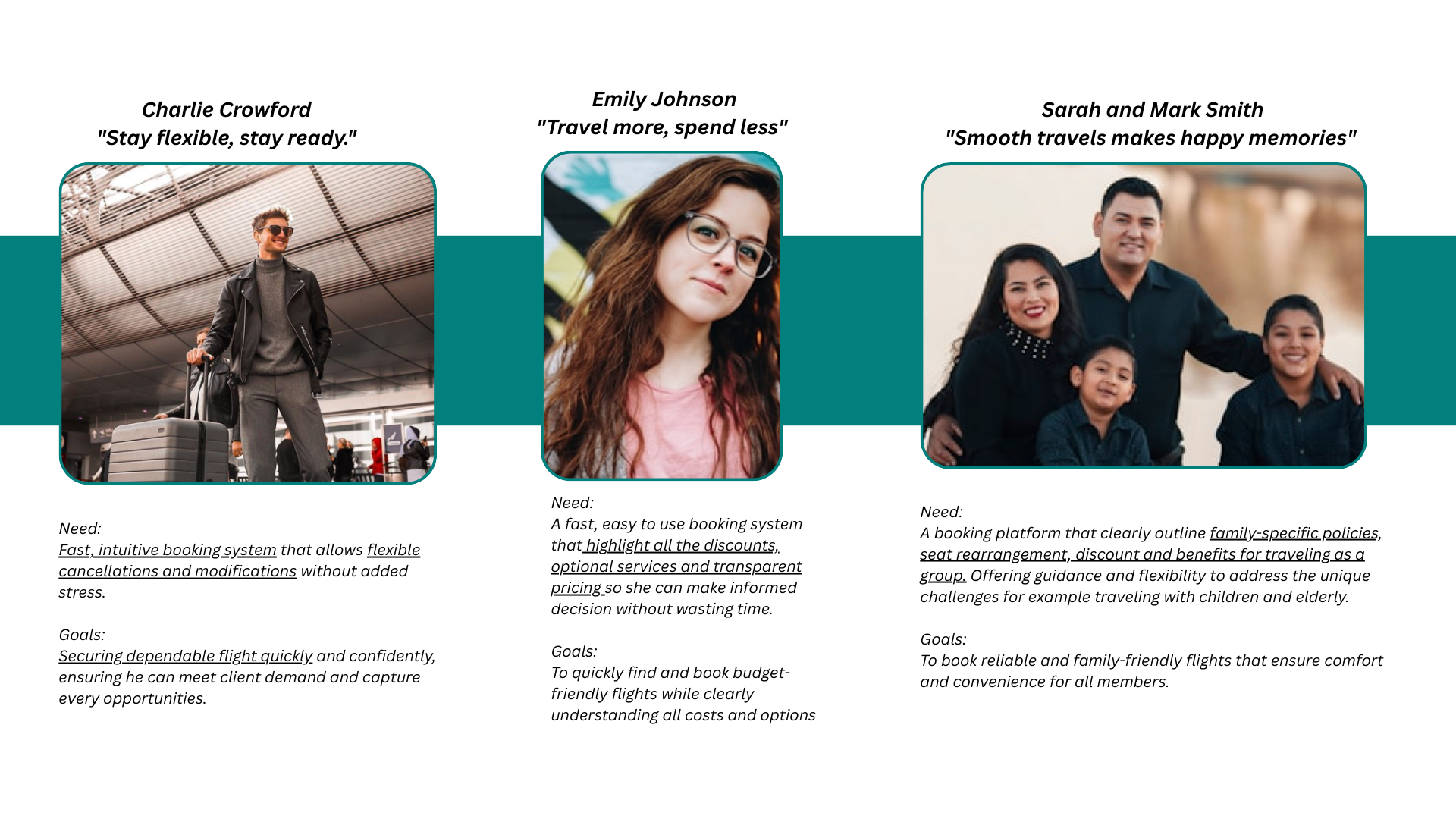
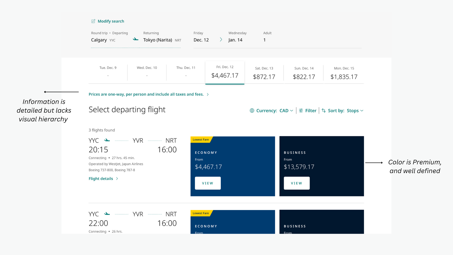
Travelers booking through WestJet often face a detailed yet overwhelming booking process, which is especially frustrating for last-minute and budget-focused users who need speed and clarity. The problem lies in between balancing necessary information with efficiency.


Solution/Goal

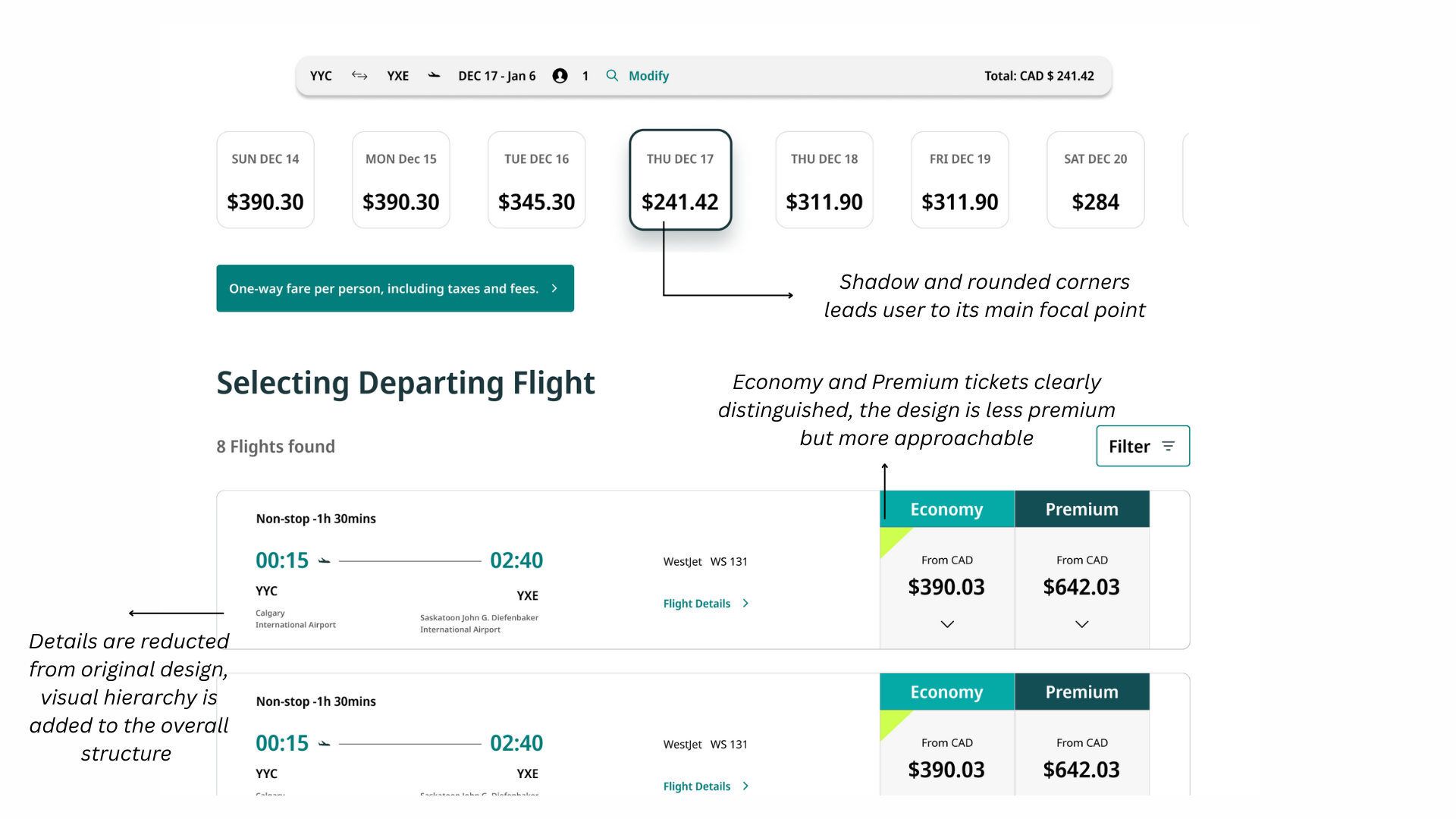
Our goal is to refine a more intuitive booking experience that allows users to book flights quickly, confidently, and with less effort.


Initial Research on User Pain Points

Prototype Overview

Through our research on the westjet Website, we found out there were 3 major questions we had to answer to establish our goal.

1: How can we reduce user click and increase retention rate with intuitive user journey and flow?

2: How might we make hidden fees more prominent to increase trust in between customers and westjet?

3: How might we create clearer visual and structural distinctions between the Economy, Business, and Current tabs to improve wayfinding, reduce cognitive load, and help users anticipate the remaining steps?
We quickly restructured the information architecture, refined the visual hierarchy with purposeful highlighting and introducing structured tables, we surfaced critical details: "such as hidden fees" that were previously difficult to find on the WestJet website.

The redesign below demonstrates these improvements comparing it to the origional designs. Feel free to explore:

Official Design

Our Adjustments

Design Decisions

We introduced a color-coded toggle navigation bar that clearly shows which step of the booking process the user is currently on. This improved wayfinding and reduced uncertainty during multi-step tasks.

Additionally, we used brighter accent colors to clearly differentiate between Economy and Business options. Previously, the distinction relied too heavily on text. By strengthening color contrast, users could quickly understand the difference at a glance.

We also reduced the size of surrounding content boxes, allowing pricing information to have more visual space and stronger emphasis. This improved hierarchy and made key decision-making information easier to scan.

Social Media Posts

Key Takaways

What did I learn? ✏️

Future Consideration🤔

1: I've learned a lot both individually and collaboratively throughout this project, gaining a strong appreciation for team dedication and attention to detail.

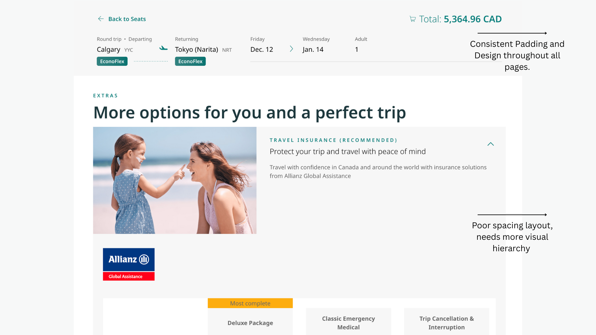
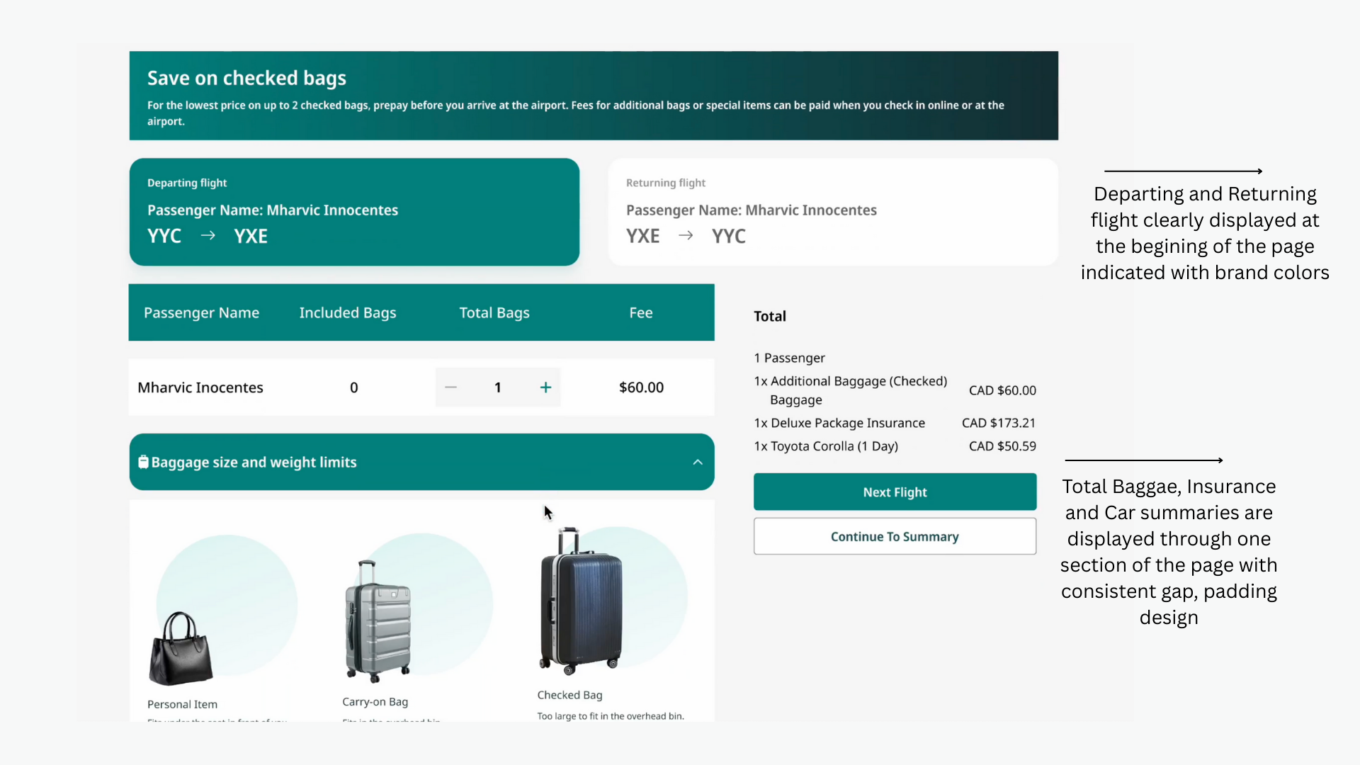
2. I learned how to maintained consistent spacing, padding, and layout across all screens, improving overall visual cohesion. Since every member had their own style and way of execution, we all learned to follow a certain guideline, and maintain the same style of design.

3. I've learned how to collaborate time efficiently within a driven team to align on design standards and execution. Sometimes adjusting details last minute and other times waiting for design updates.

1. For future references, we would continue to build on this foundation from the design systems to further strengthen design quality and efficiencies.

Let's Connect

Thank you for viewing until the end of this project. Please feel free to contact for any opportunities  or continue to view more projects. Looking forward to collaborating together to create impactful projects through creativity~

View Case Study