Katsu Sando
Concept:
The concept is to turn the existing, original brand identity into a all inclusive, fun and playful redesign for all hungry, eager pedestrians and guests from all over the world to enjoy and interact with. Furthermore gaining attraction to the shop and increase client revenue.
Tools:
illustrator, Procreate, Photoshop, Capcut
Project type:
Independent School Project
Deliverables and role:
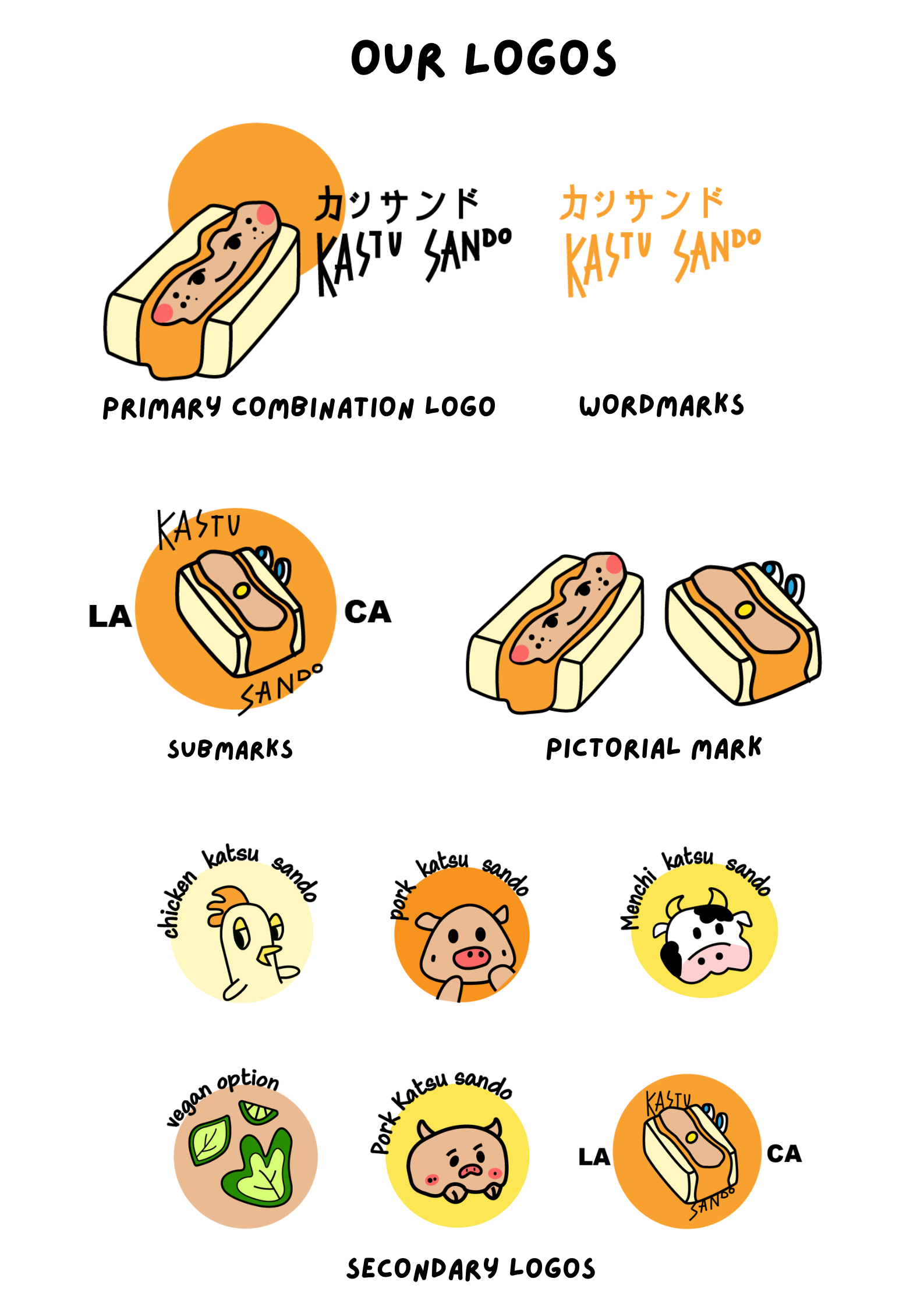
Typograph · print ready files · brand identity · packaging mockup · coupons · stickers, takeout boxes.
Constrains:
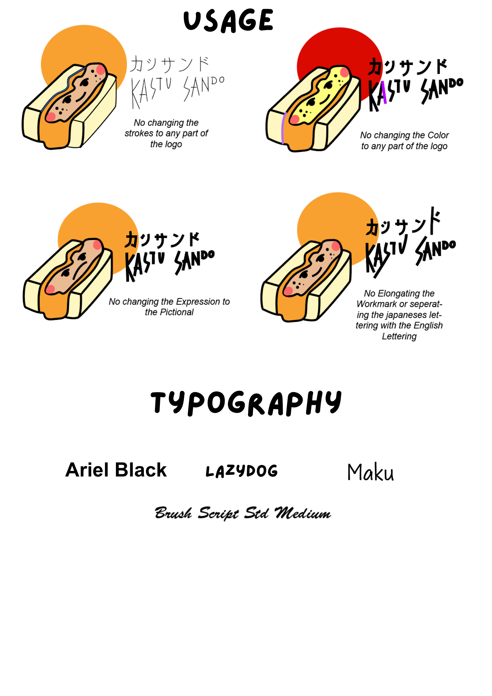
Colors must be easily printable and readable.
Files need to be readable at any scale
Designed solo without additional support. No access to original files
Problem/Backstory:
katsu sando, a Japanese pork fried cutlet sandwich shop in LA is made to bring unique flavours to for all to share. They have recently rebranded their shop. But, the finished logo and overall brand identity doesn’t match up with their product; a yummy crispy Japanese pork cutlet sandwich with crispy cole slaw. The current branding targets mainly American audiences with its retro vintage color themes, toast mascot, basketball shoes and sponge bob like eyes. This can cause confusion to pedestrians who may be hungry and eager to come inside and take a peek. Additionally, the designs stray away from the shop’s original goal, home made, curated flavours for all to enjoy. Below are a series of Brand guidelines I’ve created to align the shop more to its users and goal.

Solutions
saves time and effort: By creating an overall reusable brand identity, shop owners can clearly explain what a katsu sando is and tailor the customer’s taste from curated illustrations.
Increase traffic and sales: Consumers can easily identify shop’s branding and recommend the restaurant to others. Furthermore, this unique mascot can increase traffic online and bring virality to the brand.