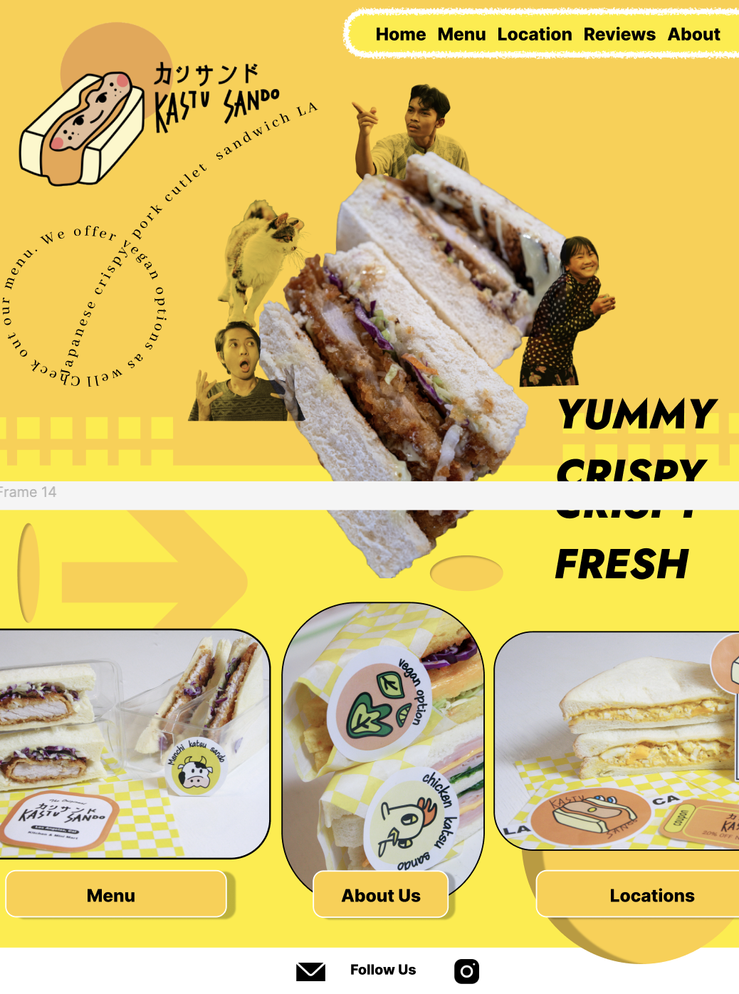
Katsu Sando, a Japanese Sandwich shop located in LA is made to bring unique, homecooked flavors for all to share. They have recently rebranded their shop. But, the finished logo and overall brand identity doesn’t match up with their product; a yummy crispy Japanese pork cutlet sandwich with crispy coleslaw. This project explores how a redesign could refine the product's identity.
5min read
Brand-Product Mismatch
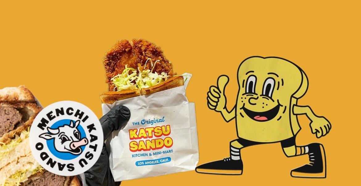
The current logo and visual identity doesn't reflect the shop’s main product. Creating a disconnection between the product itself and the customer experience. Elements in it orgional logo; the toast mascot, SpongeBob-like eyes, and basketball shoes primarily appeal to an American audience, but katsu sando is a Japanese American fusion dish which offers more than toasts.
Straying from Original Brand Goal
The rebrand moves away from the shop’s mission of providing homemade, curated Japanese flavors for everyone, risking a diluted identity and unclear messaging.
Reusable Brand Identity
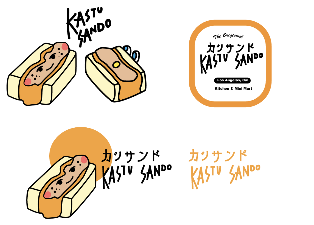
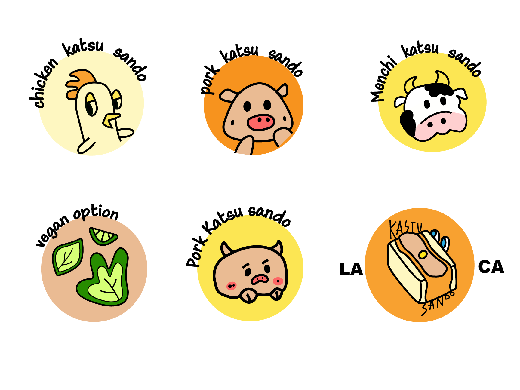
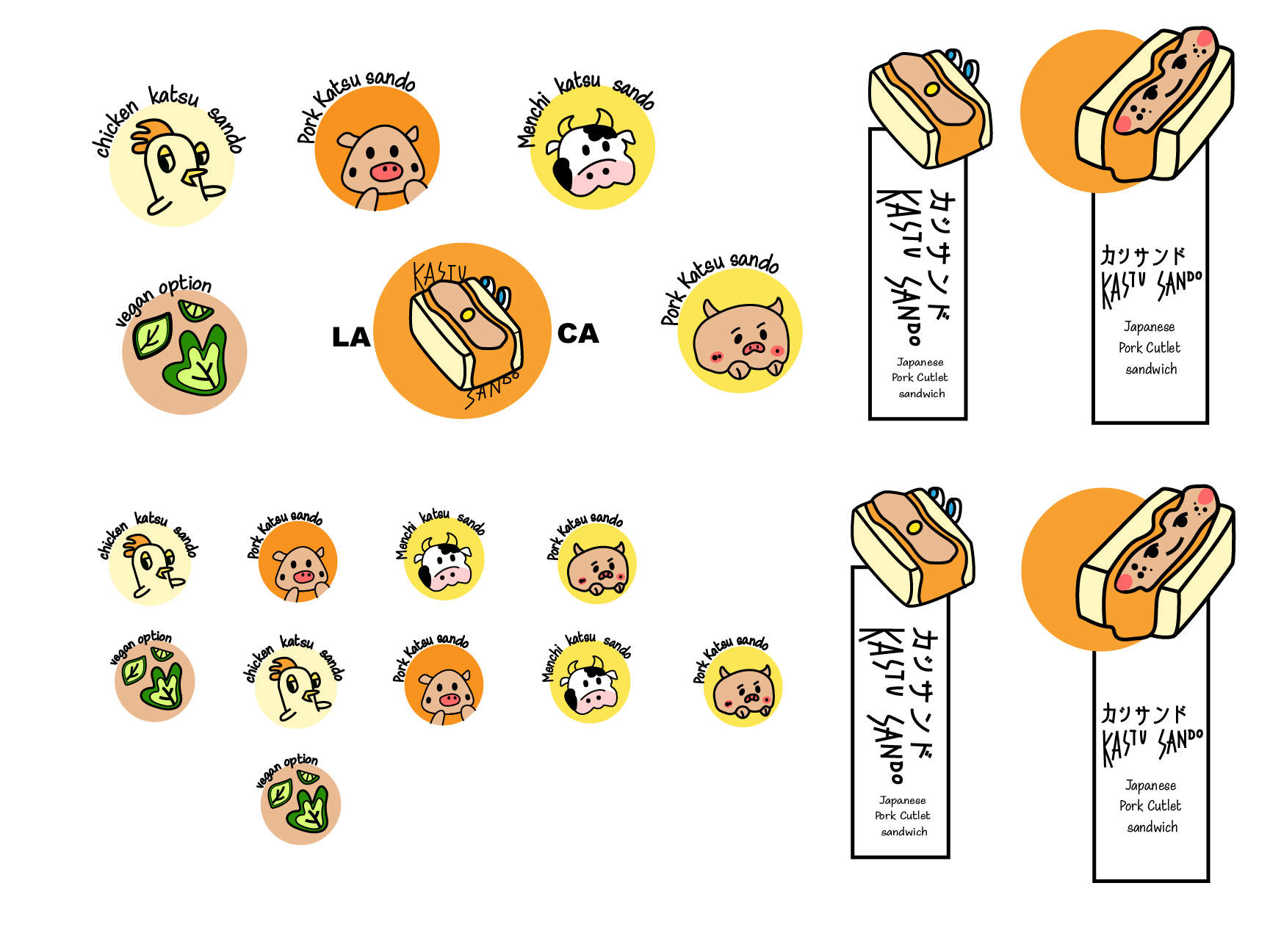
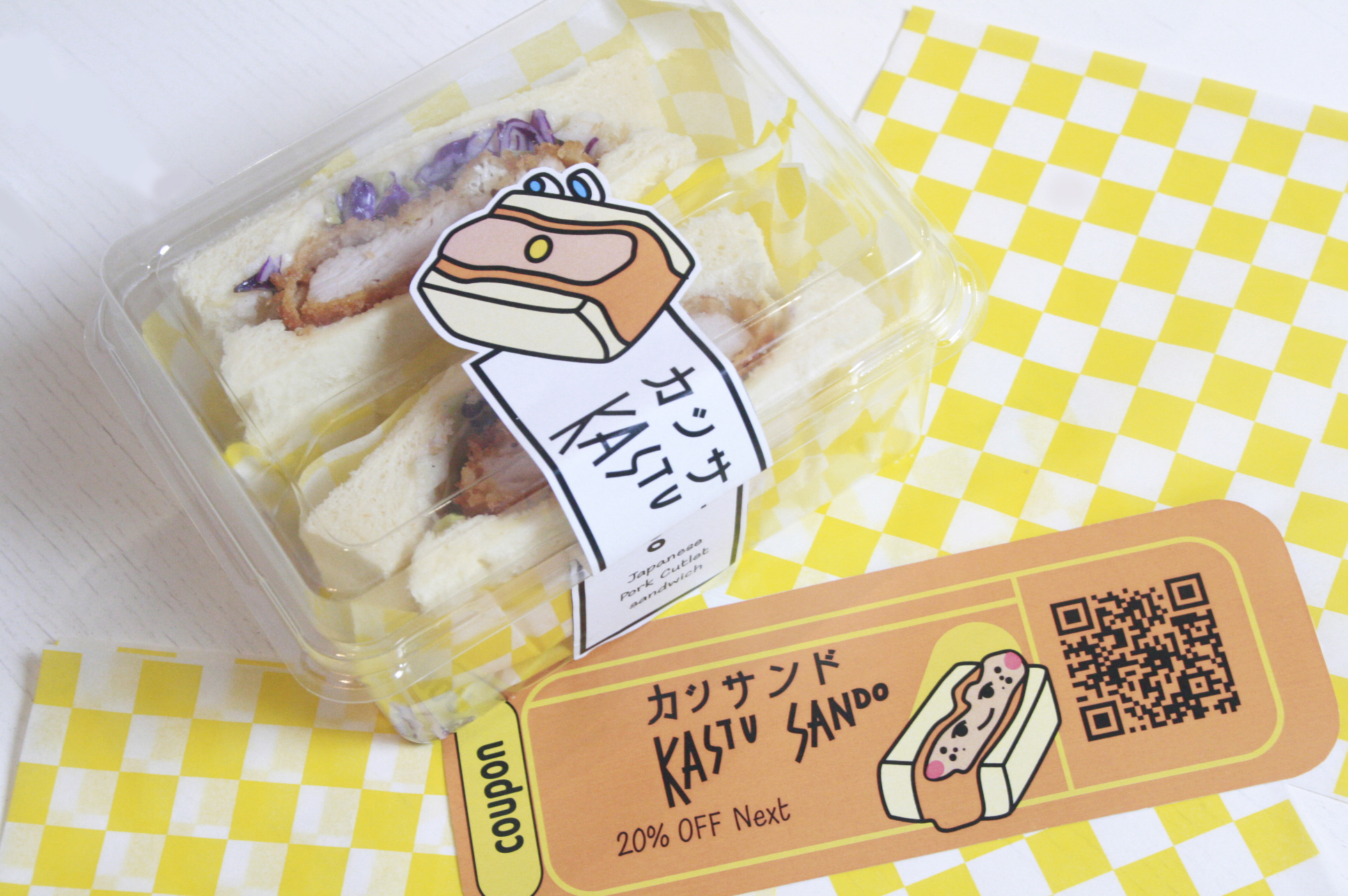
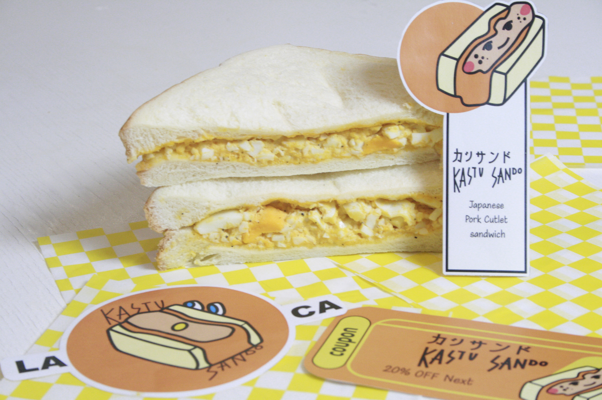
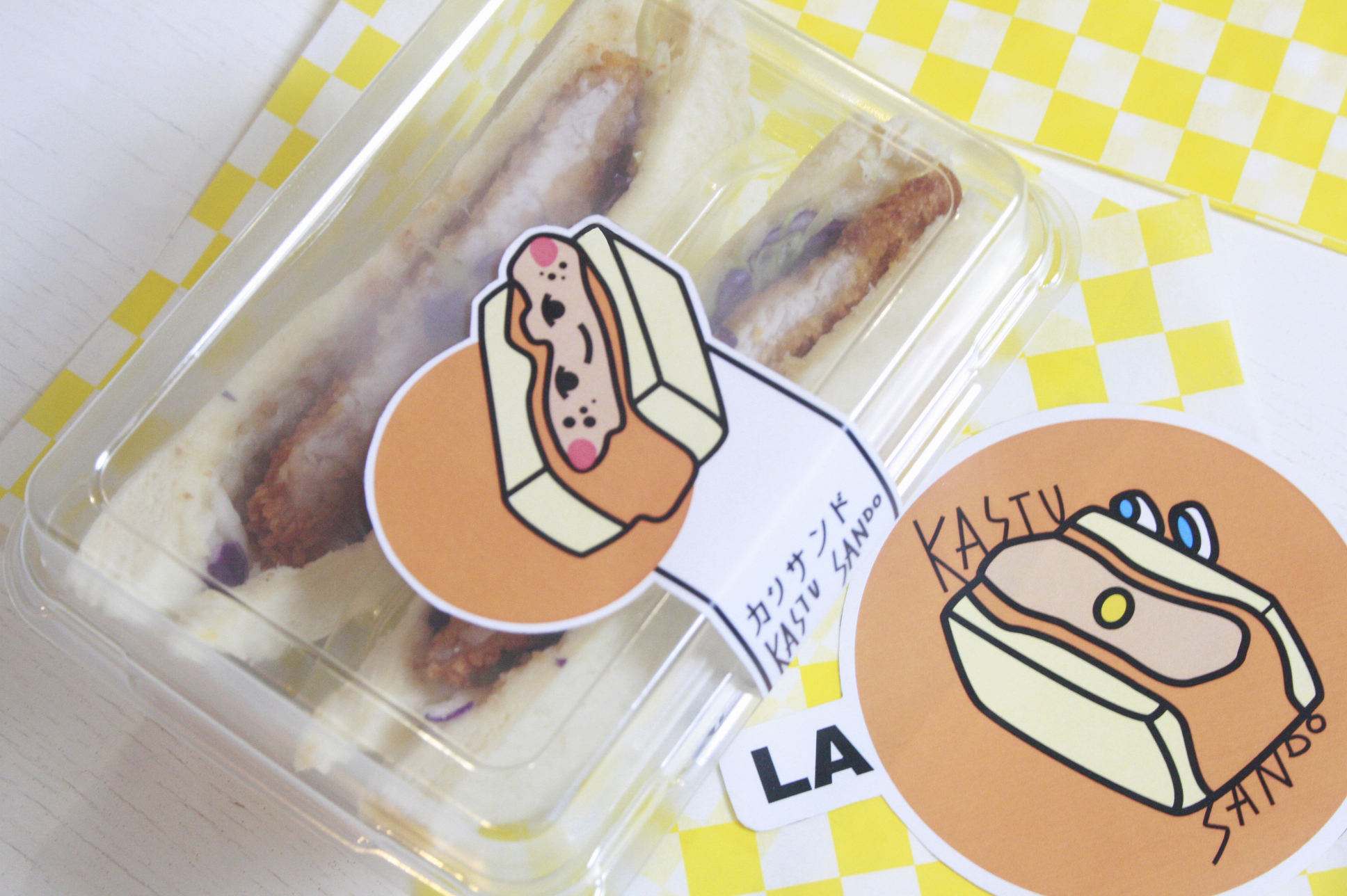
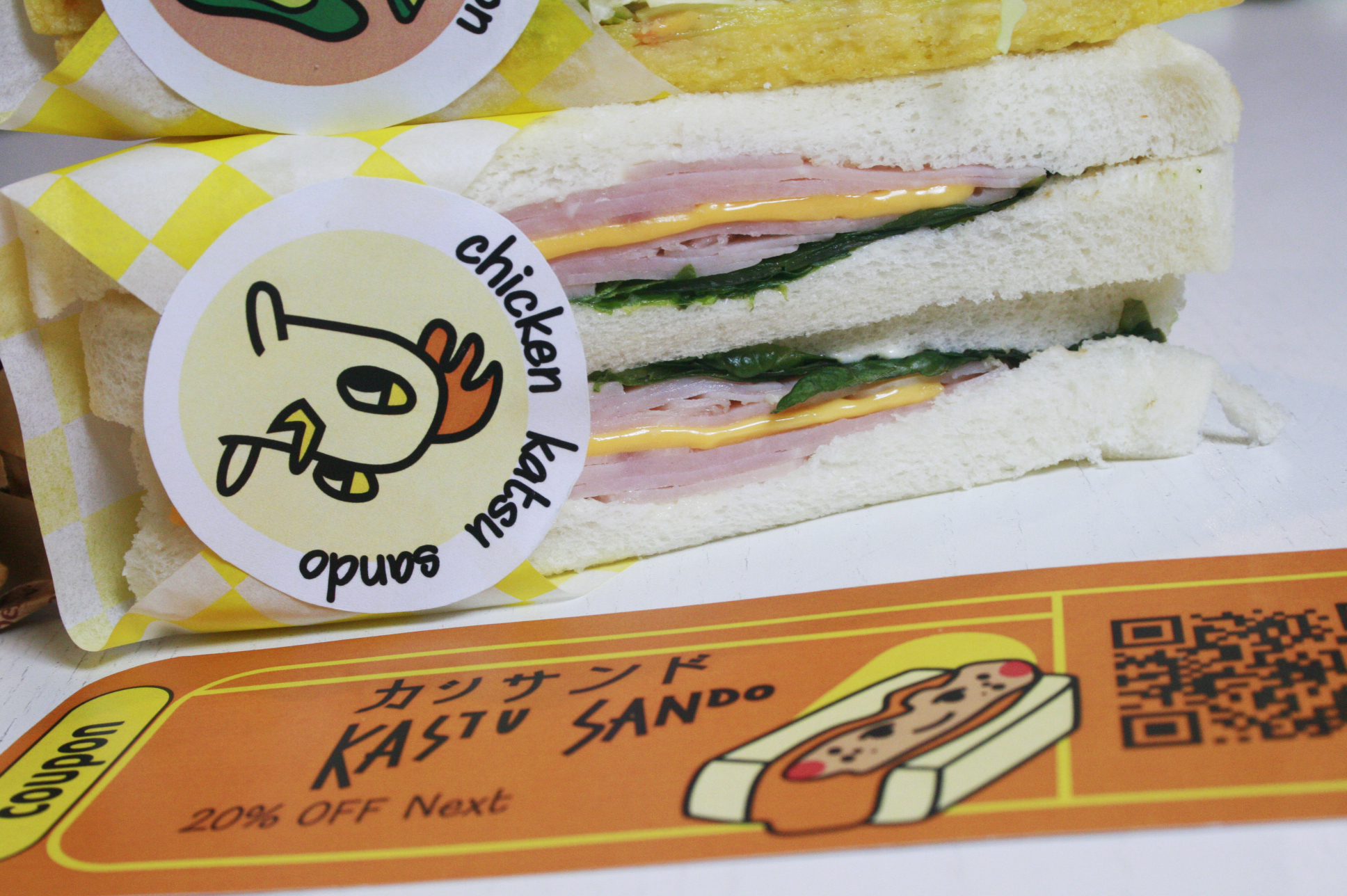
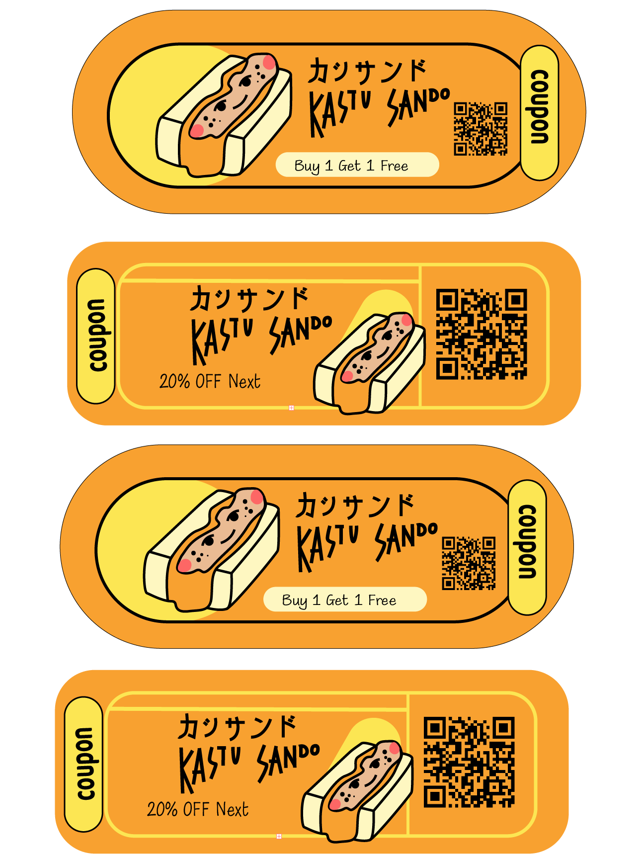
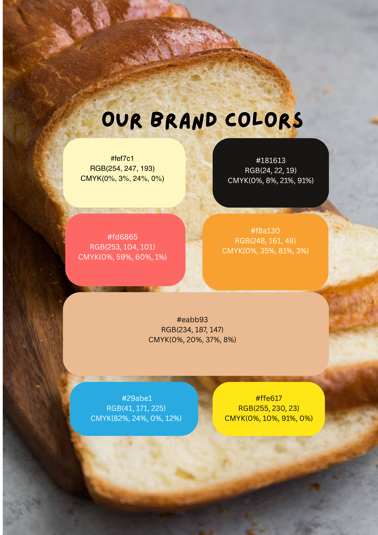
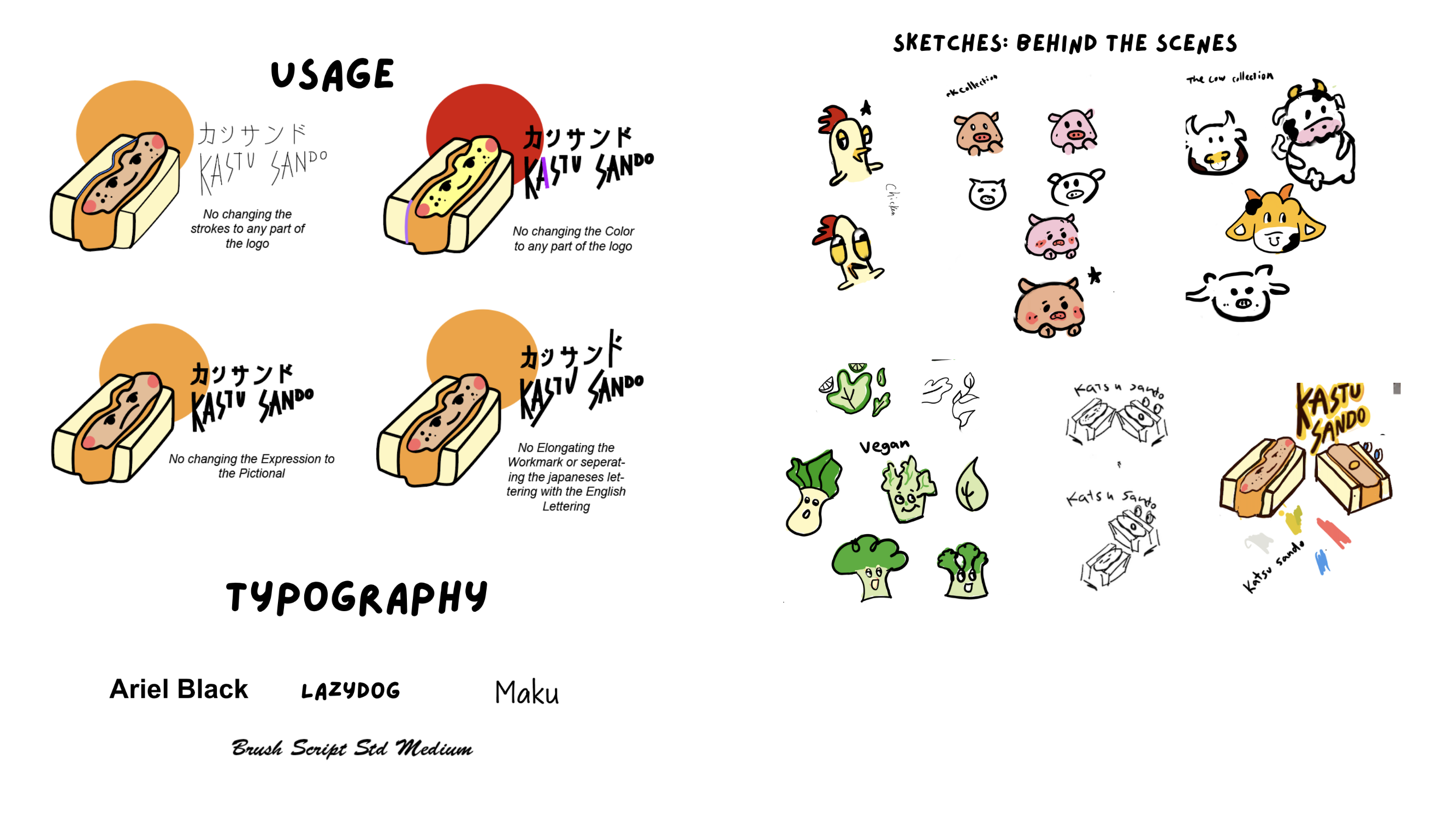
Developed a scalable and cohesive brand system that can be applied across menus, packaging, social media, and in-store visuals. This approach saves time and effort for shop owners by providing ready-to-use assets for all touch points.
Increase Traffic and Sales
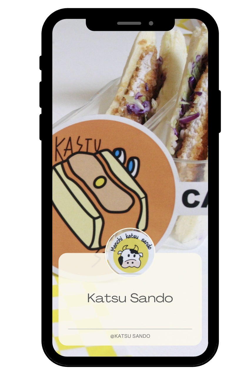
The newly redesigned branding should make the shop easily recognizable to consumers, improving word-of-mouth recommendations. The unique mascot and playful illustrations are designed to create online shareability, increasing visibility.
Overall, the solution aligns the visual identity with the shop’s mission, encouraging both in-store visits and digital engagement.
Download Digital Assets
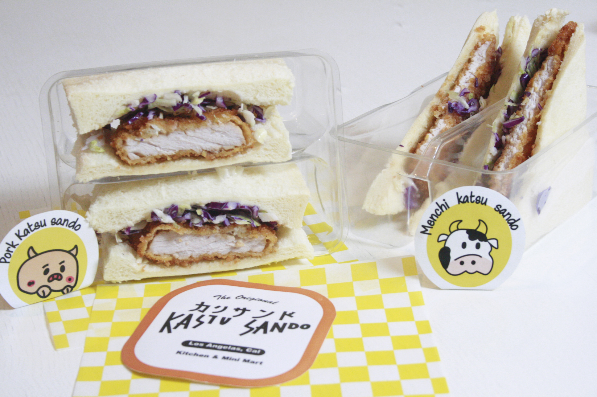
Cultural & Product Alignment; The solution has to reflect the Japanese culinary roots and highlight the product (crispy pork cutlet sandwiches) without alienating current customers.
Practical Implementation; Any new brand guidelines needed to be feasible for implementation across menus, packaging, and digital channels.
1. Experiment with different directions until the brand is centralized with the message, created an inclusive and accurate representation for local audiences
2. Made thoughtful design choices and consider different variation and created scalable solutions.
1. If I were to further extend this project, I would get more feedback from real customers to see how the redesign comes across.
2. Next time, I could lear to refine smaller details like spacing, type choices, and consistency ahead of time to help elevate the final result.