Spoilert- Optimizing food management to minimize waste
Context
Problem, research and timeline
Prototype
Logo Designs
Main UI feature
Usability testing
Context
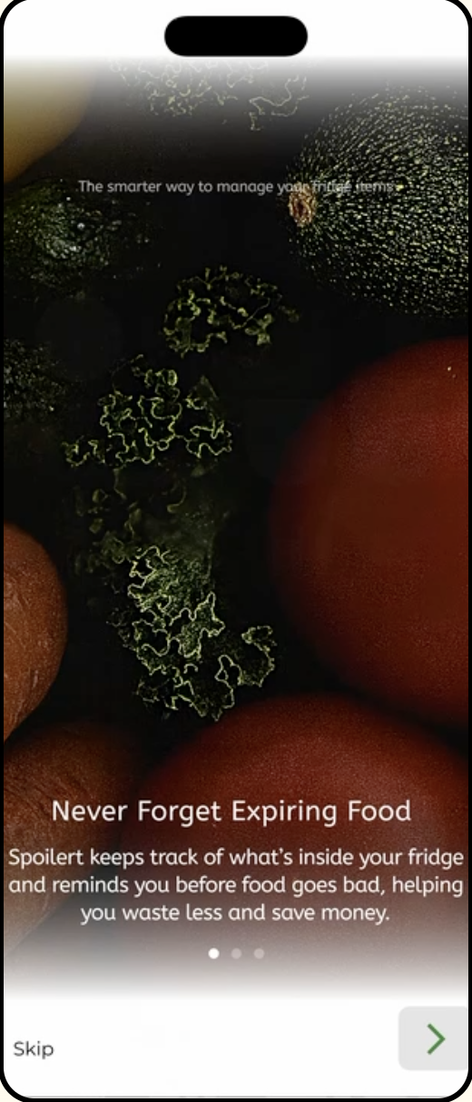
Food waste continues to be a growing issue in households, often caused by forgotten expiry dates, over-purchasing, and poor shared organization. Spoilert was designed to help users track food freshness, reduce waste, and simplify grocery management in shared households. 7 min read
Project Conceptual Digital App
Project type and duration 4 Month school project
Skillsets Branding (Illustrator) Wireframe and Prototypes (Figma)
My Role Led user research and pain point validation Designed user flows and wireframes Created low- to high-fidelity prototypes (Figma) Conducted usability testing and implemented iterations Collaborated with branding and web designers
Problem
85.4% of surveyed users reported struggling to track expiry dates, often discovering spoiled food too late. In shared households, there is no centralized system to manage groceries, leading to over-purchasing and unnecessary waste.
Solution
Create an mobile App that: • Logs purchase dates and calculates dynamic expiry timeline. • Alerts users when items are close to spoiling. • Displays items in order of urgency on the home screen. • Suggests grocery stores based on frequently purchased items. • Provides produce storage tips to extend food lifespan. • Automatically rewrites weekly grocery lists.
To validate our problem, we surveyed 55 Individuals from different age group and backgrounds, and our main pain points includes:
The most requested feature was seeing expiry dates listed in order of urgencyThe least important feature was managing multiple fridges
65.4% said they would actively use an app to manage groceries
85.4% struggle with tracking produce expiry dates
Research
☞
Key Decisions
• Users want to see expiry information immediately. • Users forget how to store produce properly. • Users rewrite grocery lists weekly.
• Logs purchase dates and calculates dynamic expiry timeline • Integrated storage tips tied to specific grocery items. • Auto-generated grocery lists based on consumption history.
Prototype Overview
Main Feature Details: How might we prevent food spoilage, save our users time and money at the same time?
The automated expiry system showcases expiry dates based off of user input and alerts users with widgets whenever a product is about to spoil.
We made this our primary feature placing it on the homescreen, giving big labels to how many days a product is untill expiring and placed them in order because according to the survey conducted, this is what most users want to see when they open spoilert
A grocery discount function follows below suggesting the best grocery store based on user's most used items.
In addition, it also showcases daily discounts which saves users additional effort and time on researching the best grocery stores and writing down a grocery list which leaves users more time to focus on other major tasks.
Many users are confused on how to store fruits and vegetables, this tips and trick feature solves the root of food wastes by informing users how to prolonging product longevity, which gives constent updates based on updated grocery trips.
Logo Ideation
Peer Feedback: Peers noted that the first logo appears fresh, vibrant, and effectively communicates the idea of keeping food fresh. In contrast, the second logo was perceived as distorted and visually associated with spoiled or deteriorated food.
Chosen Logo: The first logo variation was selected because it best reflects the brand’s overall goals. It stands out as unique, conveys freshness clearly, and incorporates a playful visual wordplay that aligns with the brand’s fun and approachable personality.
Wireframe with Handoff Annotations
The wireframes delivers a series of processes during our initial brainstorm including pain points solutions and additional comments, it walks through how a user is able to enter the app, keep track of expiry items, imput items, grocery lists.
In this case, it's combined with the user flow to help developers and designers understand the basic flows, accessibility sections and notes to handoff to developers.
Usability Testing and User Feedbacks
We conducted moderated usability testing with 5 participants.
Results: 4/5 users completed tasks without guidance Average task completion time improved by 10 minutes after iteration Confusion around labeling significantly decreased after navigation updates
Key Iteration: Early users struggled with item input labeling. We simplified terminology and clarified call-to-action buttons, resulting in smoother navigation.
Key Takaways
What have I learned? 🤩
What should we do next? ⏭
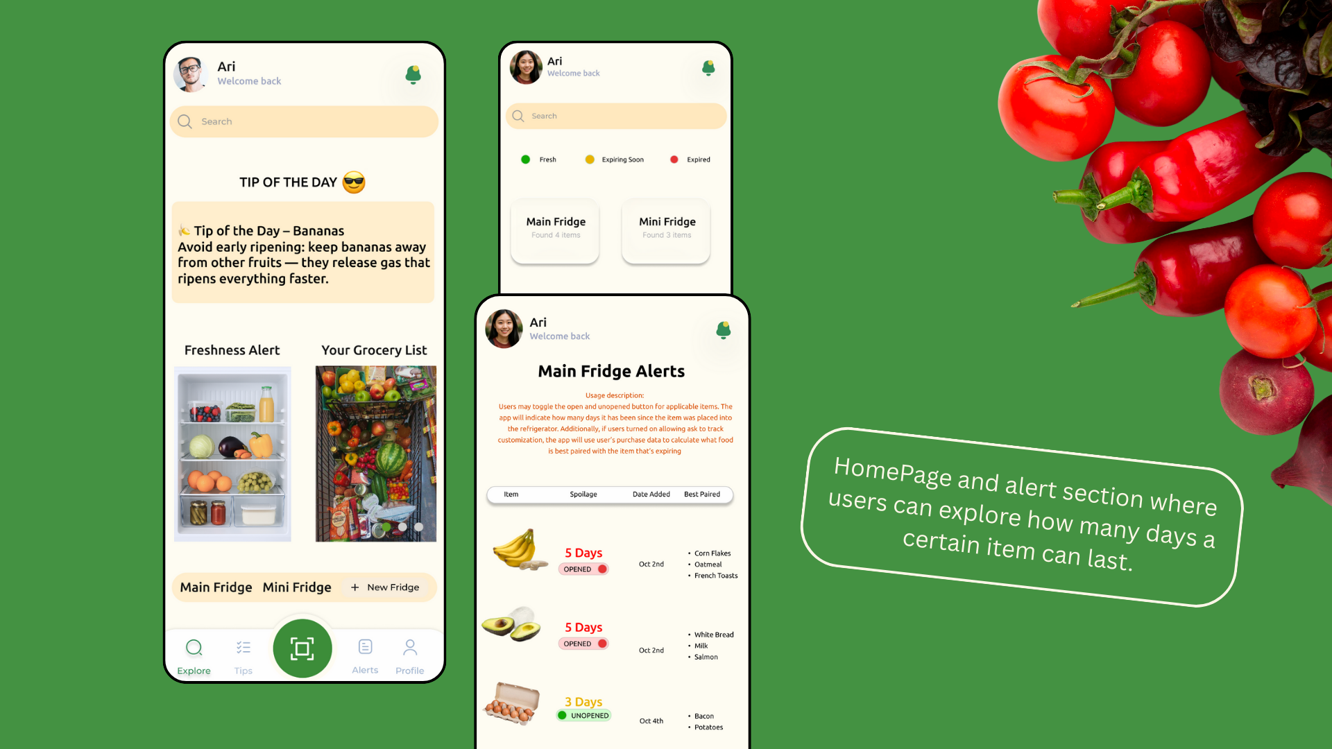
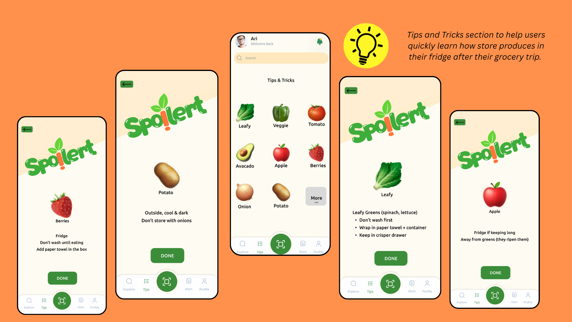
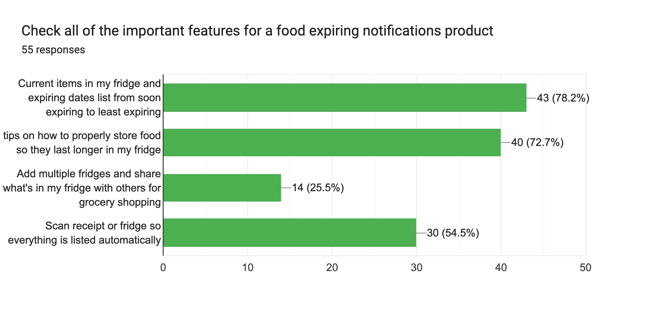
1. How to make intentional design decisions that lead to results based on fact and research instead of simply designing for visuals. An example for this is the expiry tracking and shared groceries to address everyday and most votes user pain points. 2. How to stayed organized throughout the process and kept the scope realistic. By creating a realistic gant chart, everyone was able to complete each sections within a realistic timeline
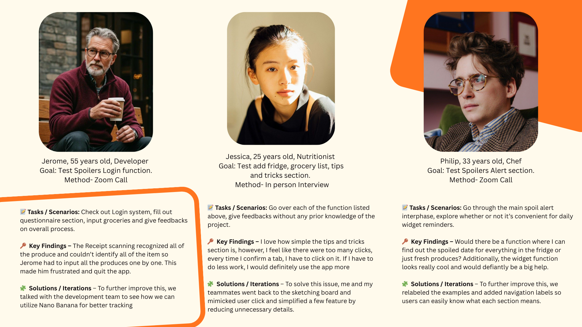
1. Improve the interactions and flows to make the user experience feel smoother by reducing clicks and adding screen readers to facilitate accessibility. 2. Refine the UI further to ensure clarity, consistency, I would love to work with a developer for the higher-fidelity prototype to better demonstrate the full user journey.
Let's Connect
Thank you for viewing until the end of this project. Please feel free to contact for any opportunities or continue to view more projects. Looking forward to collaborating together to create impactful projects through creativity~