Improving Apple Notes through Notion

Context
Problem
Solution
Constrains
Key Desicion
Final Relection

Context

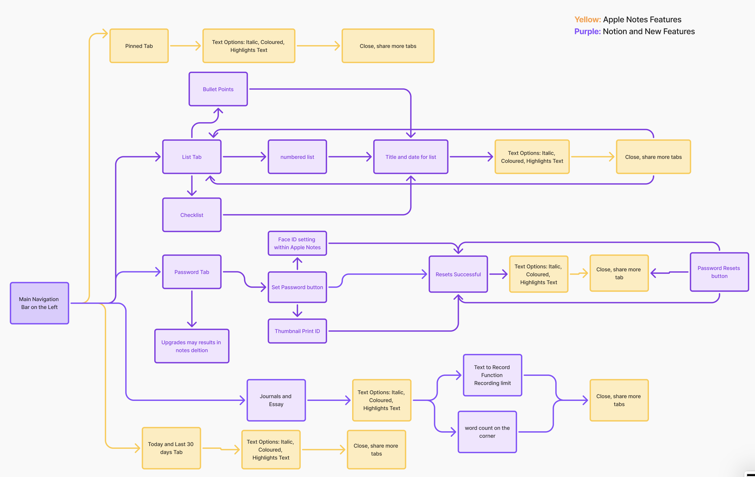
Apple Notes is one of the most commonly used apps for everyday tasks, quick ideas, and personal information. As users rely on it for more types of content—notes, passwords, reminders, recordings—the app’s simple structure becomes limiting. This project explores these limitations by creating interactive prototypes that test improved organization and usability.

7 min read

Project
Feature Integration Case Study
Project type and Duration
Independnt conceptual summer project 
Skillsets
Ideation (User research, personas and workflow)
Hi fidelity and low fidelity prototypes (Figma)
My Role
User Research, User flow, MoSCoW research, Hi- Fi Prototype

Problem statement

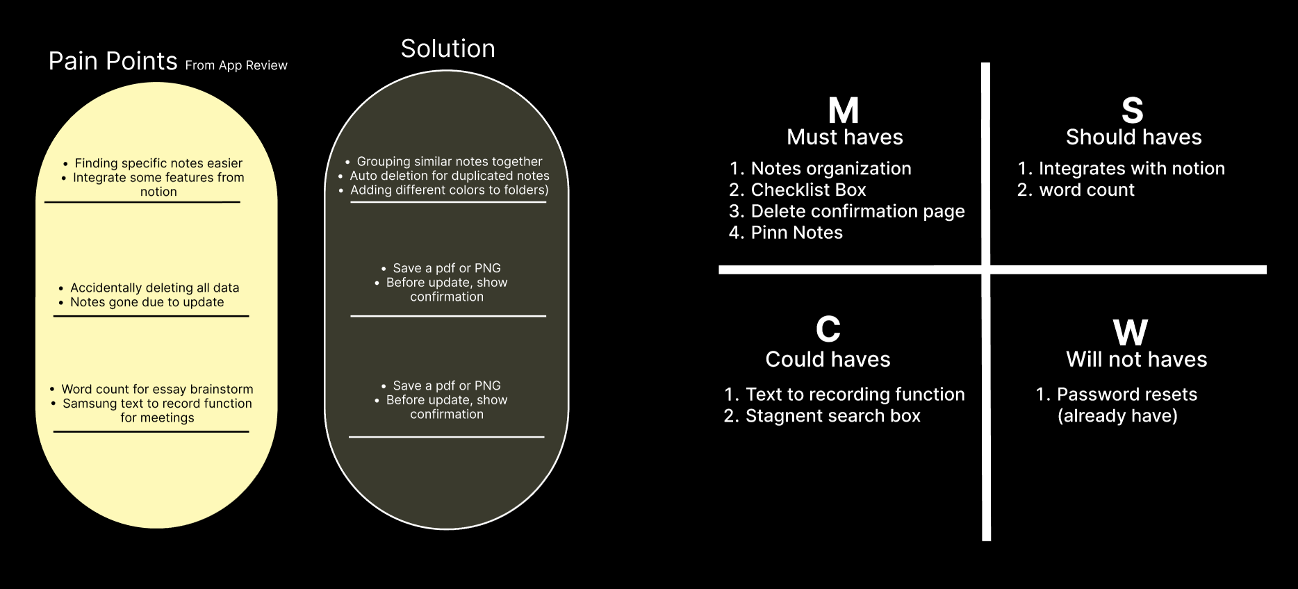
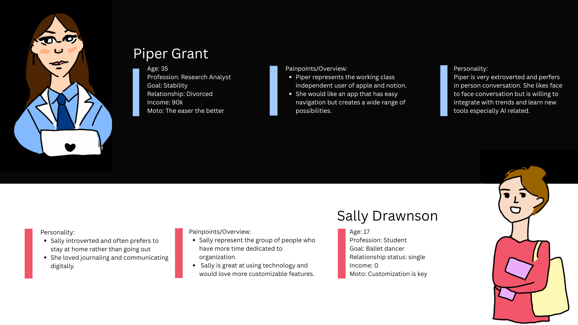
User feedback from Pimary and Secondary research revealed three recurring issues:

• Notes were frequently lost or difficult to find due to an unclear information hierarchy and inconsistent structure.

• Users struggled to navigate from search results back to the original folders where their notes were stored.

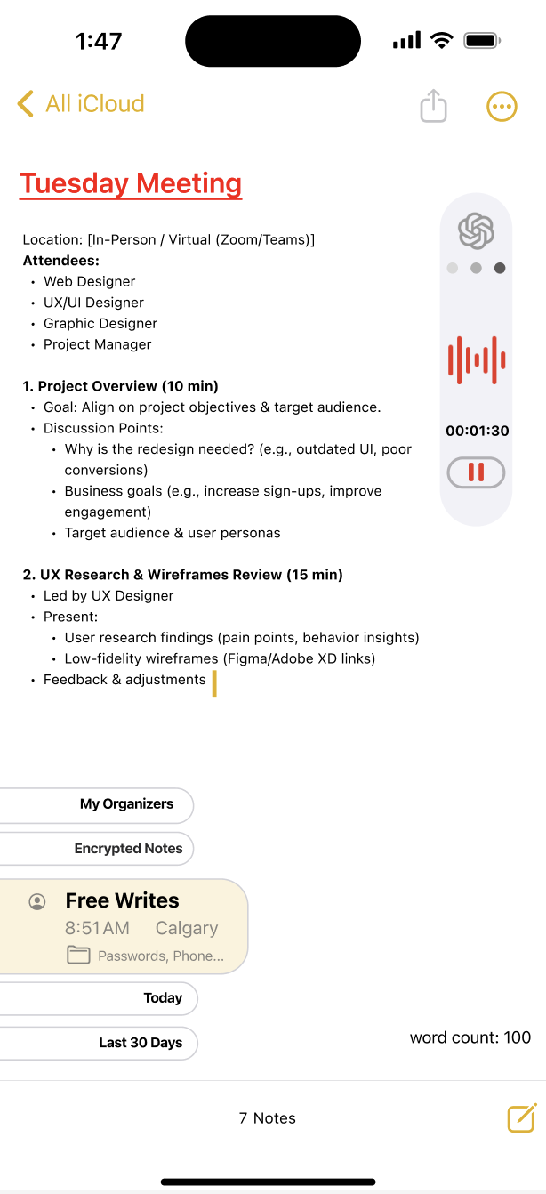
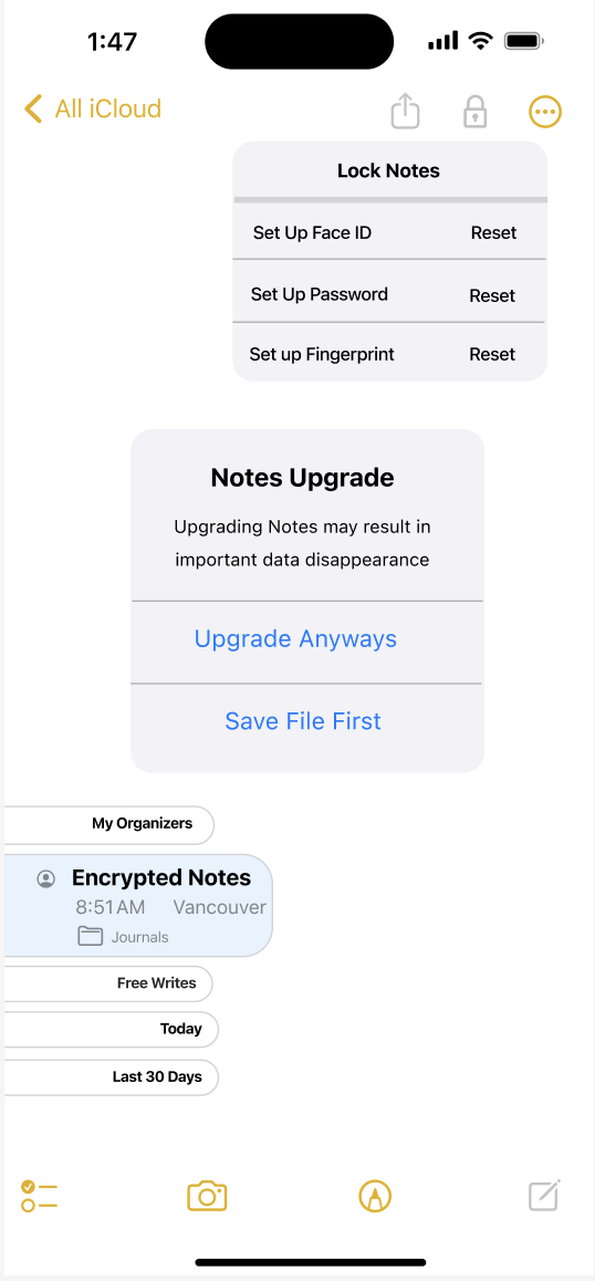
• The platform lacked advanced organizational tools, such as built-in word count tracking and structured recording features.


Solution

Rather than replicating Notion’s full flexibility, I selectively integrated structural features  while maintaining Apple’s minimal interface standards.


Initial Research on User Pain Points:

My notes has disapeared out of nowhere.
Just a really useful app. If you guys could lean it in the direction of notion, it would be even better!
If you search and find anything you can't go back up the hiearchy to find the source folder.
Recording and writing simultaneouly feature would help greatly.
It's missing one major feature that would improve its functionality- a word count.

Ideation to design outlines

Through one-on-one interviews, I discovered that users weren't struggling with note-taking itself, they were struggling with finding, organizing, and trusting where their notes were stored.

Using the MoSCoW method, I prioritized solutions based on user impact. Instead of adding more features, the design focused on improving structure, visibility, and security, resulting in clearer navigation and faster note retrieval.
Next, I wrote down how the system blueprint of the app would flow together, drawing a fundamental skeleton between apple's current notion flow while adding text option, color, share feature from notion

Combining Apple notes branding versus notion color branding

Key Design Decisions:

I explored combining Apple Notes’ minimal, distraction-free interface with Notion’s structured color system. To balance clarity and personality, I kept a neutral base layout and introduced controlled color accents for categorization.
Cognitive Load Management
Full Notion-style color blocks can increase visual noise if overused. I restricted color to functional elements only.

User Familiarity
Many users are already comfortable with Apple’s native note-taking patterns. Maintaining that structure lowered the learning curve.

Visual Hierarchy Improvement
Strategic color use improved quick scanning and categorization without sacrificing minimalism.

Prototype Overview

Key Features Introduced: I implemented a redesigned folder structure to improve usability and information security. The new folder organization enables users to convert individual tabs into actionable, reusable notes, reducing tab overload and making critical information easier to locate and manage.

Organize Notes, Record Thoughts

This feature uses the help from generative AI to self organizes meeting recording, transfering long, informative messages into understandable bullet points for anyonw who missed the session.  

Messy tabs to approachable folders

The homepage uses folor tabs and folders (A system apple users are already familiary with) and stores notes tabs accordingly for users to find within seconds. Additionally, they are also Customizable

Easy access to Tabels and Lists

Users may drag tables, add list s from any folders and switch to any folders on their current interphases

Maximum Security Protection

This newly added feature allows users to lock notes via Face ID, Password and fingerprint. Additionally, a confirmation prompt was added, suggesting users to safe all information first, before upgrading notes system to secure all data analytics.

Reflect and Resets

What have I learned? 🤓

1. A minimal design is helpful, but without strong structure, users can easily lose important information like passwords, recordings, or updates.

2. Studying Notion helped me understand how flexible organization (folders, hierarchy, and visual structure) can improve usability

Future Consideration 🔮:


1.
Refine the organization system by testing clearer categories, tagging, or smart grouping for different content types.

2.  Explore customization options while keeping the interface simple and uncluttered. Iterate on the prototype based on feedback to ensure it feels seamless and Apple-like.

Let's Connect

Thank you for viewing until the end of this project. Please feel free to contact for any opportunities  or continue to view more projects. Looking forward to collaborating together to create impactful projects through creativity~

View about me section